

Claude Design: the complete guide to real work
Setup, the prompts that escape the default, and the Cowork → Claude Code workflow to steal.

In case you missed it, Anthropic dropped two releases in quick succession last week, and I spent the weekend in the canvas, losing most of Saturday and a fair chunk of Sunday to it.
By Sunday evening, I had a list of frustrations, a list of small wins, the prompt patterns that work, the workflow for real work, and my answer to the question that everyone was asking all over Twitter and LinkedIn: is Claude Design actually coming for Figma, or is everyone losing their mind because Figma’s stock dropped 7%?
Was the weekend lost? Not entirely. But I’m sharing the output: The setup, the prompts that escape Claude Design’s default, and the Cowork → Claude Design → Claude Code workflow I run for real work. The workflow is the part to steal.
What shipped
Opus 4.7 dropped Thursday, April 16. Claude Design dropped Friday, April 17 — chat-and-canvas inside claude.ai, powered by 4.7. Figma saw roughly $1.4 billion in market value wiped off their stock price. Adobe and Wix took smaller hits but stayed roughly intact.
Design got all the news coverage, but the model is what actually matters. Opus 4.7, the upgraded model underneath Claude Design, can read screenshots far more accurately than anything Anthropic has shipped before, and accepts images about three times larger, allowing the design tool to look at a dense UI screenshot and actually recreate it.
What it actually does
From my session and Anthropic’s own list: interactive prototypes, wireframes, mockups, pitch decks, landing pages, social assets, code-powered prototypes. Plus voice modules, video, shaders, 3D, and AI embedded inside the work it produces.
What it takes, makes, and exits:
In: text, images up to 2,576px on the long edge, document uploads (DOCX, PPTX, XLSX), live web captures, codebase links.
Out: HTML, React, and CSS rendered into a live canvas.
Edits: four surfaces — chat, dynamically-generated property sliders, inline comments on canvas elements, direct DOM editing.
Exits: HTML, PDF, PPTX,
.zip, org-scoped share URL, Send to Canva, or a handoff bundle to Claude Code.
We’ll come back to the exits in a moment.
1. How to access Claude Design
Claude Design is a separate product from everything else. It doesn’t live inside the Claude browser or desktop app, and can only be accessed by it’s own URL: claude.ai/design.
✻ If you’re on Pro or Max:
Go to claude.ai/design. Sign in.
You do need one of the paid plans.
✻ If you’re on Team or Enterprise:
Claude Design is off by default. Your admin must turn it on:
→ Organization settings → Capabilities → Anthropic Labs → toggle on.
2. Understanding the interface
When you create a new project, the interface splits into three parts:
Left panel: Chat interface for conversational design
Right panel: Visual canvas where your design appears
Top toolbar: Tweaks, Comments, Edit, and Draw tool
Every project type (prototype, slide deck, template, etc) will ask you to attach or create a design system — it’s not a requirement, but having a design system will ensure consistency across all your work.

I do appreciate that Claude Design already allows you to maintain multiple design systems in the UI, and allows you to assign systems to various projects.
I initially connected the GitHub repo for claude-marketing and my custom fonts (just in case). Claude instantly recognized my color palette, typography, and even the button styles I use across my products. Within about 15 minutes, I had a working design system with a full color palette, typography scale, spacing tokens, and reusable components like icons, cards, and navigation.
3. Prompting out of the default
If you don’t have a design system yet, and are kicking the tires on a new idea — Claude Design is where to start. Keep the prompt simple. Just enough context for Claude to get the idea, without pre-loading the model and starving it of room to figure it out
I started with Meridian, an imaginary portfolio analytics platform for institutional investors.
Build a landing page for Meridian — a portfolio analytics platform for institutional investors. Audience: portfolio managers and CIOs at mid-market asset management firms. Goal: book a product demo. Aesthetic: Swiss Minimalism.


Prompt quality still matters. Claude design does naturally default to a design system similar to Anthropic’s out of the box if you’re not careful (paper tone background colors, serif fonts, italics for emphasis) and it certainly understands some design styles — like Swiss Minimalism — more than it does others.
The pattern that works: description + goal + constraints.
But the lever isn’t the name of the movement. It’s the engineered constraint the name quietly carries: typography rules, color discipline, spacing rhythm, what to avoid. You can write those into a prompt without naming a movement at all.
For the second rounds of tests I wrote variations of a brief that does exactly that. Brüner is an imaginary quarterly print magazine on design, technology, and AI. The prompt: editorial / printer’s-shop. Technical specimen sheet, not a SaaS marketing page. Functional minimalism, every mark earns its place.
Design web homepage for brüner, a quarterly print magazine on design, technology, and AI. Aesthetic: technical-editorial. Technical specimen sheet, not SaaS marketing page. Functional minimalism — every mark earns its place.
- Visible grids. Hairline rules, column dividers, registration marks, glyphs, micrographics
- Registration crosses, crosshairs, dots-as-markers.
- Coordinate-style metadata blocks (PARAMETER / VALUE, ladder graphs, tick marks).
- Extreme scale contrast: one enormous display element (issue number or masthead) against micro-labels.
- Large letterforms may crop, bleed, or collide with body copy. Collisions are intentional.
- Containers  that stack are differentiated by background texture. Alternating from light on dark and dark on light.
- Information-dense where it appears (metadata, coordinates, footnotes), generous whitespace around it.
- Cool mineral grey background. Near black foreground + high-saturation accent (cobalt / blue family).
It should feel engineered, like a Müller-Brockmann poster.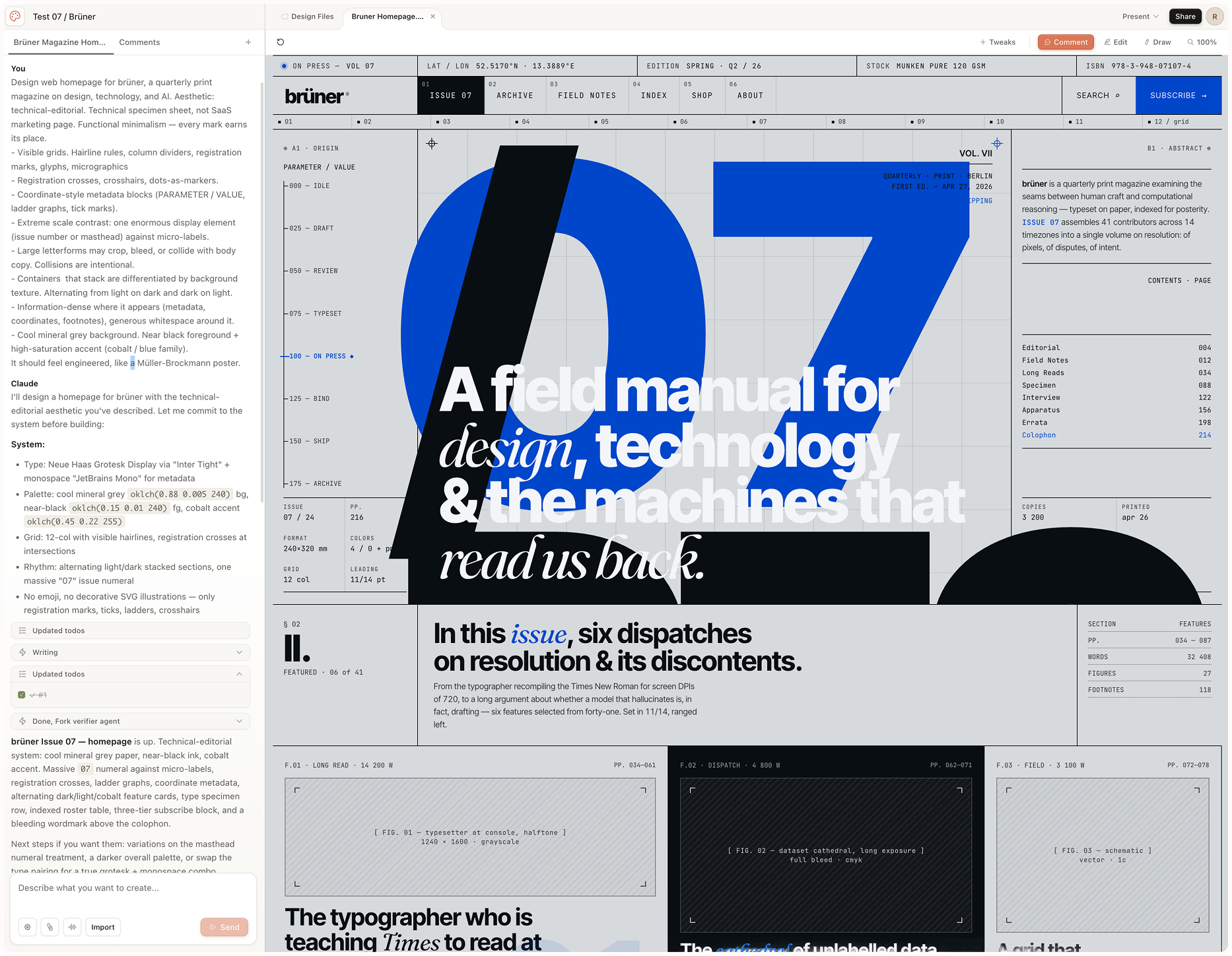


The rule that held up across both: name the movement, or name the constraint. Either works. Vague descriptors like “modern” or “clean” with no constraint behind them produce slop, regardless of how many adjectives you stack.
Though Claude responds reliably to prompt-invokable styles (some better than others), they’re not official “presets” in the UI. The full roster I tested includes claymorphism, aurora/mesh gradient, retro-futurism / cyberpunk, 3D hyperrealism, vibrant block / maximalist, dark OLED luxury, organic / biomorphic.


Would any of these need polish before production? Absolutely. But it beats designing from scratch in Claude Code — even with focused skills in play.
4. References that actually work
Two ways to feed Claude Design a reference: drag in a screenshot, or use the Claude Design Capture Chrome extension. The screenshot path is the one that earns its keep. Opus 4.7’s vision upgrade is doing the heavy lifting — screenshots dragged into the canvas read accurately enough to build from, where a model version ago they’d have produced slop that required more work to correct.
The Chrome capture is the cautionary one. Anthropic’s framing is that it “grabs elements directly from your existing website,” and there are clear rules beneath the surface to prevent outright theft of a design. The first time I tried it, the output was slop and looked like every other Claude Design example I’d seen to date. Layer-explicit prompting fixes it: replicate the structural layout, but apply OUR tokens; do not copy the source brand’s color, typography, or imagery. Without that instruction, you get the source brand’s bleed all over your output.


For now, skip the Chrome plugin and go straight for screenshot references. The trick is to be explicit about which layer you want and which layer you want replaced.
5. The advanced workflow
Here’s a workflow I would actually run for a client, so you can steal it, linking Cowork + Claude Design + Claude Code.
It starts in Cowork, and because Claude Design is only as good as the design system you give it, you need to work on its input first.
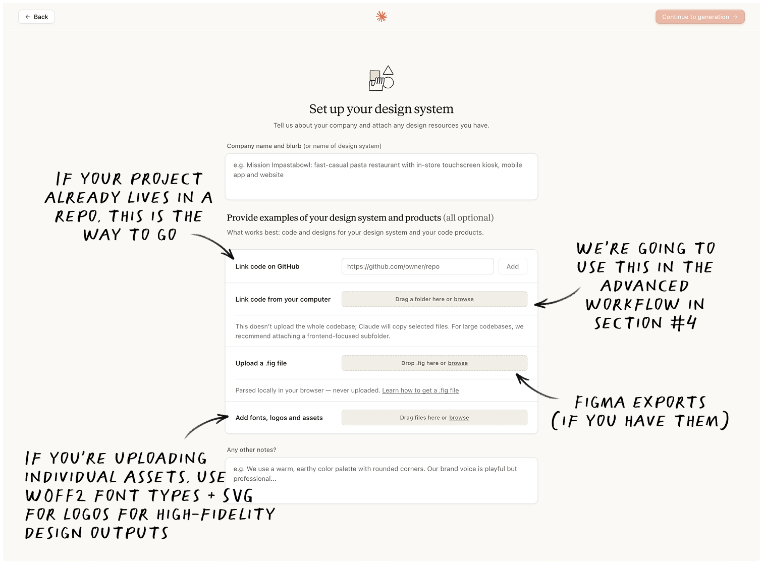
Step 1: Extract your brand system with Cowork.
Drop every brand asset you have into one folder. Logos, color palettes, slide decks, product images, lifestyle photography, landing pages, and your brand guide, if you have one.
Open Cowork. Select the folder.
And then paste:
You are a design system architect. Read every file in this folder — logos, palettes, decks, photography, landing pages, brand guides, screenshots — and extract a single DESIGN.md optimized for AI consumption.

Required sections, in this order:
1. **Brand essence** — voice, tone, audience (one paragraph)
2. **Color tokens** — primary, secondary, neutral, semantic. Include hex + HSL + intended use. Cite source file for each color.
3. **Typography** — families, weights, type scale, hierarchy rules
4. **Spacing scale** — base unit + multipliers, or note "infer from layouts" if not explicit
5. **Components** — buttons (all variants + states), cards, nav, forms, callouts. Note prop variations observed.
6. **Layout conventions** — grid, max-widths, common section structures
7. **Iconography** — style (line/filled/duotone), stroke weight, source library if identifiable
8. **Imagery rules** — photography style, illustration style, when each is used
9. **Gaps** — every primitive missing or unverifiable. Be specific ("no dark-mode tokens defined," not "missing tokens").

Cite source files inline for every claim. Where files conflict, surface the conflict and pick the most recent.

Save as DESIGN.md in the same folder.
Cowork reads every file. Outputs a clean DESIGN.md, which is an AI legible version of your brand guidelines & instructions compiled from the folder.
✻ Bonus: There is a free website called getdesign.md, if you want to test this one a brand that isn’t your own. Get copies of the DESIGN.md files of companies like Apple, Spotify, or Nike.
Step 2: Upload DESIGN.md into Claude Design.
Go to claude.ai/design, and either create your project or navigate to an existing one.
Drop your DESIGN.md in the chat as context.
Every future prompt in this project will apply it automatically.

✻ Note: Skip the folder if you already have a design system in a code repo. Link the codebase directly via the Github option when building the design system in Claude Design. Different path, but the output is the same.
Step 3: Generate
Drop the prompt and pick your format. Every good prompt has 3 locked inputs: description + goal + constraints.
**Description:** Pricing page for [product] — [one-line product description]. Audience: [decision-maker role + buying stage, e.g., "Head of Growth, evaluating before booking a demo"].

**Goal:** Drive [primary CTA — start trial / book demo / contact sales]. Secondary: capture email for the [free/lower] tier.

**Constraints:**
- 3 tiers: [Starter / Pro / Enterprise] with monthly + annual prices
- Annual/monthly toggle, default to annual with "save X%" badge
- Sticky Primary Button CTA on mobile (component already in DESIGN.md)
- Mobile-first responsive, breakpoint at 768px
- Match tone of homepage (already in DESIGN.md)
- FAQ section below tiers (5 questions, accordion)
- Feature comparison table below FAQ
- No testimonials on this page — they live elsewhere
In my tests, when the design system is uploaded and the prompt is specific, Claude Design really shines. Without it, you’ll end up with the same output as everyone else.
Step 4: Iterate
✻ Note: Don’t go for pixel perfect in Claude Design — you’ll burn tokens too quickly. Get the design close to where you want it, then hand off to Claude Code to handle the rest.
Structural changes → go in the chat:
Generate 3 alternative layouts of this page. Keep copy constant. Vary: hero structure, section order, and spacing rhythm. For each version, name what it optimizes for in one line (e.g., "above-fold conversion," "scroll-depth," "scannability for skim readers").Section-level changes → go on the canvas → Click the ‘Comment’ button. Select exactly what you want to change, and give Claude the instruction. It’ll start working as soon as you send.
Comment prompts work best when they mirror the same formula — description (where), goal (what change), constraints (what to keep) — compressed to a single line each:
Tighten 'The Collection' section. Cut the eyebrow tag, increase padding so content doesn't bump against the edge, and increase the size of the navigational arrows on each category to act meaningfully as a CTA. Change the color of the arrows to the same #EEEADE
Before a risky experiment → save a version, then proceed.
Save the current version as v1. Generate v2 using the same DESIGN.md tokens but a different deployment strategy. Vary: composition, hierarchy, information density, and motif. Hold copy, goal, and the tokens themselves constant. State the register v2 is going for in one line (e.g., "editorial-print," "consumer-product launch," "enterprise dashboard").Then when you’re ready, just click Export.
5. Getting the design out of Claude
Claude Design has no deploy. No publish. No direct GitHub push. Every output exits through one of four workflow paths; which one you take depends on where the work needs to land next.
→ Pushing to GitHub. The closest mental model I reached for is Vercel’s v0, which has read/write to Github baked in. Claude Design has nothing like it. You can connect a GitHub repo on the way in to inform what it generates, but that lane is read-only. Pushing the generated work back is a separate trip through Claude Code.
→ Handing off to Claude Code. Top-right menu, Share, Send to Claude Code. The bundle includes the project’s design files (layout specs, design tokens as CSS variables, component hierarchy, an asset zip), the chat history, and a README that tells Claude Code how to interpret the design and which screens to build first. Claude Code receives, asks one clarifying question (usually about routing), scaffolds, installs packages, builds the pages, and runs a dev server. A typical three-screen prototype is up in a browser in well under fifteen minutes. From there: standard Claude Code workflow. Git, deploy, whatever your stack uses.
...and into Figma via the Figma MCP. The Anthropic-endorsed path back to Figma goes through Claude Code, not Claude Design directly. I found it easiest to edit the command captured from the Claude Code handoff to include instructions to add to Figma and provide the link to the design file, so the whole process runs in one go.
Fetch this design file, read its readme, and implement the relevant aspects of the design. https://api.anthropic.com/v1/design/h/xxxxxx?open_file=xxxxx.html
Implement: XXXXXXXX.html - upload it into the same figma design file:
https://www.figma.com/design/xxxxxx?node-id=xxxxxxx
Use smart layout and fit/fill rules as much as possible for easy adjustments once the design is in figma.
What returns is editable Figma frames with vector layers and proper hierarchy, dropped straight into the canvas. The reverse loop also works: change something in Figma, Claude Code picks up the change, code updates. One thing worth knowing: the Figma MCP captures the running app, not the handoff bundle directly. You build first, then capture. There’s no shortcut.
To install the official Figma mcp, run:
claude plugin install figma@claude-plugins-official

Then:
/authenticate
→ Sending to Canva. There is a native export that gives you editable layers in Canva, but it’s pretty flaky. Multiple other hands-on reviewers (including an April writeup from Ruben Hassid) report the button intermittently failing in the research preview, which I can confirm. When it does actually land, you’re in Canva proper with Canva’s standard export menu.
The other exits all do exactly what they say: PDF, PPTX, standalone HTML, .zip download, the org-scoped share URL with view/comment/edit permissions. They behave. Reach for them when the destination is a deck, a doc review, or a static handoff that doesn’t need to become live code.
Where I got frustrated (and you may, too)
A few things to know before you scale this. Most are workable once you’ve got the prompts dialed in.
There is no WYSIWYG Canvas. Everything is prompt-based. Designers or visual thinkers will likely need the ability to move objects, adjust styling, experiment, and iterate by hand, not only by typing. Every change, however small, goes through chat, tweaks, comments, or DOM edit.
Creating a design system is clunky. Anthropic positions non-designers as a target user, but the onboarding asks you to ingest design tokens, component libraries, and configuration options. That’s vocabulary you only have if you’re already a designer or a developer. The whole stated point of the tool is that you shouldn’t have to.
Output is currently HTML only. SVG, PNG, and PDF export options don’t exist yet. If you need functional assets, be prepared for some extra leg work. Native raster image generation is also off the table; Claude Design renders SVG in place of raster, which is a deliberate trust/safety call rather than a missing feature.
No native URL ingestion. Pointing Claude Design at a URL to pull in stylesheets, assets, and design tokens would be a high-value, low-lift entry point. It removes the need for manual context-setting. It’s the most obvious gap in the onboarding flow.
Long sessions degrade. Fresh sessions for fresh designs. Long-running sessions accumulate context noise and the output quality slips. I noticed it around the third or fourth substantial pivot inside one session.
Figma round-trip is third-party. No native Figma export. The Anthropic-endorsed path is Claude Design → Claude Code → Figma plugin. Anima is the third-party route I’d reach for first
Large repositories cause serious browser lag. Chrome struggles with huge file trees. Anthropic’s recommendation: link a specific package or directory; exclude .git and node_modules/.
Quota burns fast on Pro. Pro is a tasting menu; Max (20x the Pro quota) is the working tier. Claude Design’s quota is metered separately from chat and Claude Code — it has its own pool, so burning it does not touch your other Claude usage until Anthropic says so.
Final thoughts…
Claude Design is one of the most useful AI tools I have tested this year. Better than Lovable, v0, you name it.
It won’t replace professional designers, give you production-ready code, or make taste and judgment obsolete. Not its job.
What it will do is compress the distance between an idea and something you can see, click, and share. That compression changes who gets to participate in the design process and how fast teams can move.
The first version of the canvas will get smoother. Fewer prompt-only edits, native URL ingestion, a design system flow a non-designer can run. Worth checking back in a release or two.
The tool executes. You direct. The quality of what comes out still depends entirely on the quality of what you put in, just as it always has. Without 4.7, Claude Design would just be a wireframe generator. With 4.7, the threat to creative SaaS is real, but I wouldn’t call it a Figma killer.
If you are building something and want to see how fast you can go from rough idea to visual prototype, Claude Design is worth your time. Just bring your design vocabulary and watch your tokens.


Did you enjoy this newsletter?
Please like it by clicking on the ❤️ at the very top or bottom of this post. This really helps get this newsletter recommended to Substack’s recommended shortlists.
Or, if you enjoyed this, learned something new, and it will help you in any way, reply and tell me about it. If you loved it, you can always treat me to a coffee.